Formatting text: fonts, size, color, alignment
Typography options for text elements: custom fonts, size, shrink to fit, color, alignment, shadow and letter spacing.
All text formatting is done through the Inspector when a text element is selected.
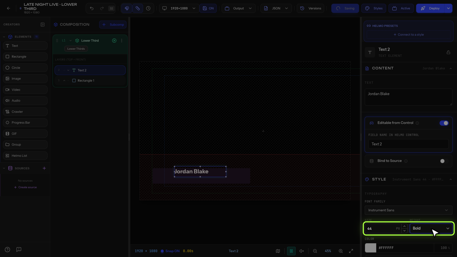
Fonts
Helmo Live includes system fonts by default. To use custom fonts, upload .ttf, .otf, .woff, or .woff2 files to Drive first. They'll appear in the font dropdown.
Size
Set font size in pixels. Recommended sizes:
- Lower third name: 32-40px
- Lower third title: 24-28px
- Headings / scores: 48-72px
- Ticker text: 28-36px
You can push font size all the way up to a 2000px cap for full-screen headlines and bumpers.
Shrink to fit
Text uses shrink to fit by default: if the content is too long for the element's box, the font size scales down automatically so nothing gets clipped or cut off. Your text stays fully visible no matter how long the name or headline is, which is ideal for data-bound fields where the length can change on air.
Color
Click the color swatch to open the color picker. You can enter a hex code directly (for example, #FFFFFF for white).
Alignment
Choose Left, Center, or Right alignment. This affects how multi-line text flows within the element's bounding box.
Shadow
Text shadows add readability, especially over video backgrounds. Set:
- Offset X/Y: direction of the shadow
- Blur: softness (0 = sharp, higher = softer)
- Color: usually black with some transparency
Letter spacing
Adjust spacing between characters in pixels. Positive values spread letters apart, negative brings them closer. Useful for titles and stylized text.